Posts from date 2017-5:
Weekly progress post #66: Emptiness Tags: Games, ESA 2, Baba Is You, Streaming, Regular updates Map generator (open-source!) Tags: Games, Other, Small games, World generator, Procedural generation Weekly progress post #65: Cool Ghosts Tags: Games, ESA 2, Baba Is You, Streaming, Regular updates Weekly progress post #64: On Tags: Games, Baba Is You, ESA 2, Streaming, Regular updates, Plans Weekly progress post #63: Back to ESA 2, sort of Tags: Games, ESA 2, Baba Is You, Streaming, Regular updates, Plans Questions regarding platformer development
Posted on 2017-05-29 01:43
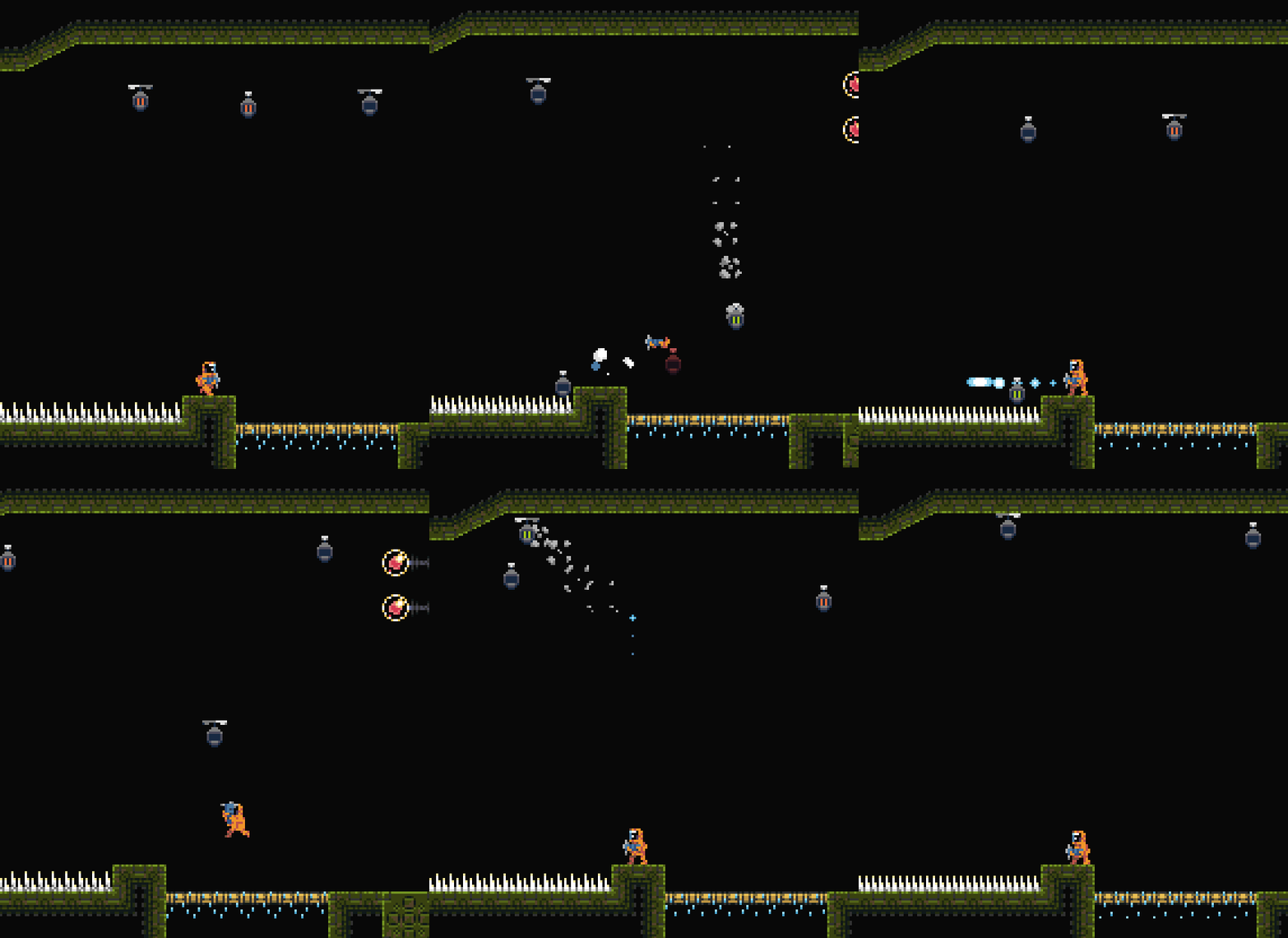
In today’s stream I spent way too long just playing ESA 2, trying to gather all the powerups (and bumping to annoying things, unfinished content and being just generally unhappy about many aspects of the game). Two new rooms were added along with some fixes and a new neutral critter, but I really need to figure out things to make the game feel more lively and/or interesting. It doesn’t help that there’s still a ton of things to get done! I’ve tried to add things quickly with the mindset that I’ll come back later to adjust them, but at this point the general unfinishedness of everything is starting to become a factor that makes development slower. :(
At the start of the stream I also implemented some stuff for Baba Is You. I still feel much more like working on Baba than ESA 2, but I should probably force myself to work more on the latter just to get forward. At least Baba doesn’t have quite as annoying design-related problems (although a whole bunch of design issues of its own). Still, I’m pretty sure I can get Baba done in a reasonable amount of time!
Posted on 2017-05-26 23:19
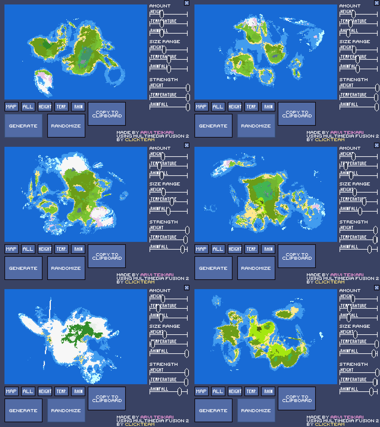
Well, that sure took a long time! I’ve promised to release a tutorial of how my map generation works multiple times over the years; for various reasons I haven’t managed to fulfill that promise until now. But better late than never, eh?? EH???
I kinda want to add a tutorial for generating towns as well, plus adding names for the different biomes. On top of that, road generation & area-of-influence generation are the two big things missing; the former is basically just A* so it’s not super interesting, but the latter might be a cool thing to add as well. We’ll see! No promises.
GET THE GENERATOR HERE!
The generator is fully MMF2-made, but should run on Clickteam Fusion 2.5, assuming that you have the plugins required. There’s a nice little executable included, so not owning MMF2/CF2.5 doesn’t prevent you from toying around with the generator!
The plugins required are:
– ‘Surface’ by Looki: https://lukasmeller.com/mmf/extensions/beta/Surface1.5.zip
– ‘MT Random object’ by Chris Branch: https://www.clickteam.com/webftp/files/mmf2/Exts/MMF2ExtPack1.exe
I’m not sure how the MMF2 Extension Packs work these days since the program itself has been discontinued; if you can’t install it, tell me and I’ll try to resolve the issue (or contact Clickteam).
 1
1  1
1
Posted on 2017-05-19 02:52
On today’s stream I worked a bit on Baba and a bit on ESA 2. A new room was added for the latter along with a new enemy and a new set of platforming obstacles. Not much, but the new enemy is pretty cool in my opinion. Right now I’m feeling fairly unsure about the art direction of ESA 2 (again) plus getting it done is seeming like a huge task (again), partially due to Baba taking so much of my attention. For Baba I implemented a new word which seemed to work pretty OK, although designing puzzles with said word could get too frustrating for the player pretty fast, as Mokesmoe kindly pointed out. I’ve been in the process of updating the game’s graphics to a higher resolution and that I updated a couple sprites during the stream as well, and finally a new level using the aforementioned new word got added. I was going to implement levels using a different word at first, but some bugs/inconsistencies turned up and I had to change plans.
It’d be pretty cool to get Baba done this Summer; that doesn’t seem impossible although I should definitely polish it as much as possible before that (and I guess marketing-wise it’s already way too late for it :( )
Posted on 2017-05-10 02:29
In today’s stream things kept trucking forward; I polished a larger room I had started last time in ESA 2, added some new decorative tiles to the final area and implemented an elevator and some mildly story-related stuff that goes with said elevator. The final area still feels pretty empty and uninteresting and I should probably sit down and make some notes on how to make it feel more consistent and flow better, but the new tiles already helped a bunch. The area definitely needs more in terms of large, imposing enemies and interesting structures, it’s supposed to be (kinda) the final area, after all!
In Baba I fixed bugs related to a new word and tried to implement a puzzle around said word although that didn’t go too well. There was some neat discussion and suggestions (mainly by Mokesmoe, thanks!) and working on Baba on-stream felt really nice as a result. I’ll have to start thinking of the game’s level structure soon because I’m already sitting on a whole bunch of levels and have some hopefully interesting ideas on how the progression of the game would go. The graphical design is still an issue although I have some concepts in my head that might work.
Posted on 2017-05-08 02:56
Today I actually managed to concentrate on ESA 2 again, kinda! 2 new enemies and 2 new rooms were added, although the latter of the two enemies will definitely require some more work. The final area is extremely bare-bones -looking, but the contents are kinda starting to get there. I really want to figure out some puzzles to put there, though; it feels like ESA 2 has been sliding to the same pattern as ESA 1 in that it’s so much easier/faster to design platforming challenges & fights that puzzles become pretty much nonexistent. I’ve written a list of potential puzzle ideas but I keep forgetting to look at it + several of those ideas are still at least partially platforming-driven.
Baba also got worked on because I really just can’t keep my hands off that project; I’m getting closer to 50 finished levels and I have ideas for more! I’ll just have to figure out where to take the game graphically and what I want to do with the general “style” of the game. What I have now is pretty nice in my opinion, but I feel that the game could really benefit from a more carefully-crafted visual/auditive design. We’ll see!! The game’s logic is also starting to get to pretty confusing levels due to the new words I’ve added, but hopefully that’ll be mostly a thing that allows for interesting puzzles rather than a problem to fix.
Posted on 2017-05-05 01:29
I was asked these questions on Twitter and since Twitter is Twitter with its letter limits, I decided to import the questions here and answer them more elonquently:
What are the key features a 2d platforming game should have?
“2d platforming game” is a fairly abstract concept and defines only a very small part of a game’s design; there are 2D platformers that vary from each other greatly, and most of their defining features don’t stem from being 2D platformers but rather from other things. Technically I could try to find some defining features that 2D platformers should have that aren’t dependent on other factors, but the list of said features would be pretty limited. Let’s try:
Things a 2D platformer needs to have:
- A playable character
- Sideways perspective
- Obstacles that block your way or offer something to stand on
- Gravity (although even this can be done without)
There are also things that 2D platformers usually have, such as collectibles, goals, failure conditions, enemies, HP, lives, levels, environments etc., but with a strict definition none of them are required to call a game a “2D platformer”. (Note that the list of things 2D platformers need was just something I made up on the spot, I’m sure there are valid arguments to reduce even more things from it!)
If someone were to learn game development via making a 2D platformer, I’d say that using something like Super Mario Bros. as a guideline on what’s expected from such a game could be the best way to go, because it contains all those strictly platformer-related concepts listed above, but also lots of handy learning opportunities in form of those other, less definitive but nonetheless handy things such as coins, score, level progression and losing.
What’s the best art style for a side-scrolling platformer?
This is a very subjective question! The definition of “best” definitely hinges a lot on both the budget and the personal taste of the developer. The game screen should be easily readable, i.e. it should be clear what is background and what is a wall, an interactable object etc., but there’s a huge amount of options to choose from in terms of unique artstyles that achieve that, and whether one of them is better than the others depends entirely on the opinion of the player/developer.
I’m personally rather biased towards retro-style pixel art graphics with stretched pixels (see: Cave Story, Eternal Daughter, Maldita Castilla). It’s important to note, though, that even stretched-pixel pixel art doesn’t have to look retro (see: WitchWay, Fez, Hyper Light Drifter for a non-platformer example) and that non-stretched-pixel pixel art is definitely also an option and can be achievable by a smaller team (see: Within a Deep Forest, IJI). Outside of the realm of pixel art things require a bit more work pretty quickly which might not be worth it for a smaller team, but on the other hand the results can be sweet (see: Saira, Braid, LIMBO). Taking a nonstandard approach to the artstyle might also be a good option (see: An Untitled Story), so nothing’s really that clear. These are obviously just my own personal tastes!!
If I were to suggest an artstyle for someone making their first 2D platformer or aiming to learn game development, I’d probably recommend something like the visual style of the NES Megaman games; stretched pixels, limited colour palette, very high readability, fairly easy to work on, tile-based background art to lessen workload and so on.
What type of music would go well with a pixel art style?
I don’t think I can really answer this properly. “Pixel art style” in itself is such a vague concept that depending on other factors pretty much any kind of music could go well with it. There are good examples of orchestral(-style) music (see: Owlboy, Titan Souls, Gods Will Be Watching), retro-style music (see: Cave Story, Spelunky classic, Shovel Knight), music with more modern instruments that I can’t think of a good category name for (see: Nuclear Throne, IJI) or minimalistic electronic music (see: Within A Deep Forest). Games like Undertale combine stuff from several musical styles very successfully, and some utilize existing music as their soundtracks (see: Space Funeral, Hotline Miami).
Again, retro-style chiptunes might be the easiest way to go, but really the answer to this question is pretty much “anything”.
EDIT: I actually haven’t played Owlboy and added it in because I checked that it has an orchestral soundtrack and pixel art graphics. I’m fairly certain that the musics fit the game but I implied too much up there. My apologies!