Unnecessary fun stuff
Posted on 2010-08-05 00:18
I pondered a bit today about the way I want the possible game to handle the generated map. My current idea would be to have grid-based scrolling, so that you always see one frame, and the game ‘scrolls’ to a new area when you touch the borders. That way I can always load (and perhaps generate) new areas as required. However, there’s one problem: the maps are quite huge, and if I made every pixel represent an area (320×240), the game would get really big very fast. That wouldn’t be much of a problem otherwise, but I fear such huge worlds might get boring very fast – I think it might be better to go with smaller and tighter worlds, and have them to be full of stuff. Also, if every pixel was an area (or perhaps ‘room’ would be a better word), I probably should divide the world into regions, and the map would essentially consist of stuff in the current region. A region could be, say, 20×16 rooms in size. That’d make the map a bit easier to read.
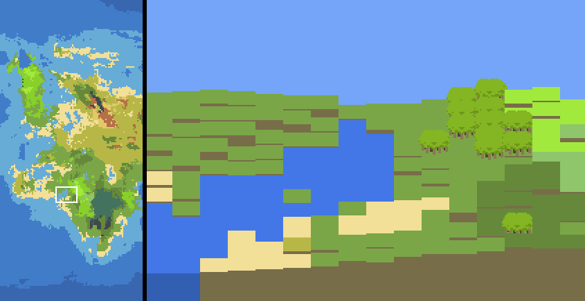
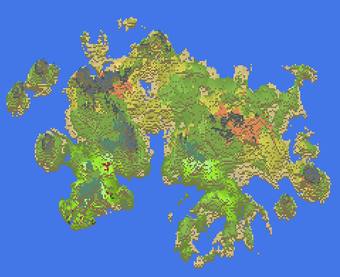
Anyway, I quickly created some kinds of ‘visualizers’ just for fun, mainly inspired by the visualizers of Minecraft. They look quite horrible and are hard to read, so I guess I wont be using them anywhere.

Here’s my first test on displaying a region separately from the map. As you see, the height makes it really hard to read. I’m overall not sure how I should treat height, though – if the game is isometric/top-down, should the game just create walls to places where the height difference is high enough? Or should there be some elaborate path system that’d create meaningful areas and paths?
Here’s also the whole world visualized. It’s hard to read, but I think it has some kind of charm to it.
